Phaser 4 Isometric Minesweeper 6편 — localStorage 기록 저장으로 마무리하기
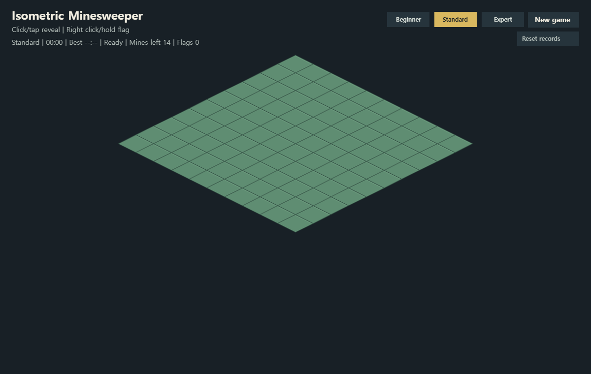
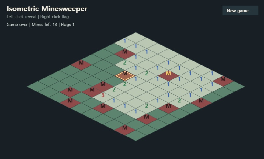
Isometric Minesweeper에 난이도별 최고 기록 저장, Best 표시, New best 상태, 기록 초기화 버튼을 추가하고 이번 지뢰찾기 연재를 마무리했습니다.
지난 글에서는 Isometric Minesweeper에 난이도, 타이머, 렌더링 polish를 넣었다.
그때까지 구현한 내용은 다음과 같았다.
Graphics 기반 깃발/지뢰 아이콘이제 데스크톱에서는 어느 정도 게임처럼 보였다.
하지만 블로그에 iframe으로 올려두고 나니 다른 문제가 보였다.
모바일이었다.
데스크톱에서는 좌클릭으로 열고 우클릭으로 깃발을 꽂으면 된다. 모바일에는 우클릭이 없다.
그리고 세로 화면에서는 isometric 보드가 생각보다 애매했다. 버튼과 상태 문구가 위쪽을 차지하고, 아래에는 다이아몬드 형태의 보드가 들어가야 한다. 억지로 줄이면 들어가기는 하지만 플레이하기 좋은 크기는 아니었다.
그래서 이번 글에서는 모바일 대응을 다음 방향으로 잡았다.
현재 데모는 아래에서 볼 수 있다.
이번 구현 후 모바일 가로 화면은 이런 모습이 됐다.
기존 입력은 단순했다.
데스크톱에서는 이 조합이 자연스럽다.
하지만 모바일에서는 우클릭을 기대할 수 없다. 그래서 지뢰찾기 모바일 구현에서 흔히 쓰는 방식처럼 tap과 long press를 나눴다.
여기서 중요한 점은 reveal을 pointerdown에서 바로 실행하지 않는 것이다.
pointerdown에서 바로 열어버리면 long press를 판단할 시간이 없다. 그래서 일반 reveal은 pointerup에서 처리하고, pointerdown에서는 long press timer만 시작했다.
this.input.on('pointerdown', (pointer: Phaser.Input.Pointer) => {
    if (this.isUiPointer(pointer)) return;

    updateHoveredTileSystem(
        this.world,
        pointer.worldX,
        pointer.worldY,
        this.boardLayout,
    );

    const hoveredTile = this.world.resources.hoveredTile;
    if (!hoveredTile) return;

    if (pointer.rightButtonDown() || pointer.button === 2) {
        this.applyTileAction(hoveredTile, 'flag');
        return;
    }

    this.startLongPress(pointer, hoveredTile);
});
우클릭은 기존 데스크톱 UX를 유지하기 위해 그대로 둔다.
우클릭이 아니면 long press를 시작한다.
private startLongPress(pointer: Phaser.Input.Pointer, tile: TilePoint) {
    this.cancelLongPress();
    this.pointerDownTile = tile;
    this.longPressTile = tile;
    this.longPressFlagTriggered = false;

    this.longPressTimer = this.time.delayedCall(LONG_PRESS_FLAG_MS, () => {
        if (!this.longPressTile || pointer.rightButtonDown() || pointer.button === 2) return;

        this.longPressFlagTriggered = true;
        this.applyTileAction(this.longPressTile, 'flag');
    });
}
현재 long press 시간은 450ms로 잡았다.
너무 짧으면 평범한 tap이 깃발로 오인될 수 있고, 너무 길면 게임 리듬이 답답해진다. 이 값은 실제 폰에서 한 번 더 만져봐야 할 부분이다.
long press 구현에서 조심해야 할 부분이 있다.
길게 눌러 깃발을 꽂은 뒤 손을 떼면 pointerup도 발생한다.
그때 reveal까지 같이 실행되면 깃발을 꽂자마자 다시 타일을 여는 이상한 동작이 된다.
그래서 long press가 이미 flag를 처리했는지 기록해둔다.
this.input.on('pointerup', (pointer: Phaser.Input.Pointer) => {
    if (!this.pointerDownTile) return;

    const pressedTile = this.pointerDownTile;
    const longPressFlagTriggered = this.longPressFlagTriggered;

    this.cancelLongPress();

    if (longPressFlagTriggered) return;

    updateHoveredTileSystem(
        this.world,
        pointer.worldX,
        pointer.worldY,
        this.boardLayout,
    );

    const releasedTile = this.world.resources.hoveredTile;
    if (!sameTile(pressedTile, releasedTile)) return;

    this.applyTileAction(pressedTile, 'reveal');
});
또 하나의 안전장치도 넣었다.
처음 누른 타일과 손을 뗀 타일이 같을 때만 reveal한다.
if (!sameTile(pressedTile, releasedTile)) return;모바일에서는 손가락이 살짝 밀리는 일이 흔하다. 이 검사가 없으면 누른 타일과 다른 타일이 열릴 수 있다.
기존에는 pointer handler 안에서 바로 toggleFlagSystem이나 revealTileSystem을 호출했다.
이제 입력 종류가 늘어났다.
그래서 실제 게임 action 처리는 applyTileAction으로 모았다.
private applyTileAction(tile: TilePoint, action: 'flag' | 'reveal') {
    const previousStatus = this.world.resources.gameStatus;
    const result =
        action === 'flag'
            ? toggleFlagSystem(this.world, tile)
            : revealTileSystem(this.world, tile, this.boardLayout);

    if (!result.changed) return;

    this.syncTimerAfterAction(previousStatus);
    this.renderGame();
}
입력 이벤트는 “어떤 action인지”만 판단한다.
타이머 동기화와 렌더링은 한 곳에서 처리한다.
작은 정리지만, 이후 chord reveal 같은 입력이 들어올 때도 같은 흐름으로 붙일 수 있다.
이전까지 Phaser scale mode는 FIT이었다.
FIT은 정해진 게임 크기를 비율에 맞게 맞춰준다. 단순한 데모에는 편하다.
하지만 이번에는 viewport 크기에 따라 HUD와 보드를 다시 배치해야 했다.
그래서 scale mode를 RESIZE로 바꿨다.
new Phaser.Game({
    backgroundColor: '#182026',
    parent: 'game',
    scene: [BootScene],
    scale: {
        autoCenter: Phaser.Scale.CENTER_BOTH,
        height: 560,
        mode: Phaser.Scale.RESIZE,
        width: 900,
    },
    type: Phaser.AUTO,
});RESIZE를 쓰면 scene의 scale.width, scale.height가 실제 canvas 크기를 따라간다.
그래서 resize 이벤트에서 layout을 다시 계산할 수 있다.
this.scale.on('resize', this.handleResize, this);private handleResize() {
this.boardLayout = this.createCurrentBoardLayout();
updateBoardRenderSystem(this.world, this.boardLayout);
this.updateUiLayout();
this.renderGame();
}여기서 중요한 부분은 updateBoardRenderSystem이다.
현재 ECS 구조에서는 RenderComponent가 screenX, screenY를 저장한다. 즉, 한 번 만든 뒤 viewport가 바뀌면 좌표가 낡는다.
그래서 resize 때 grid 좌표를 기준으로 screen 좌표를 다시 계산한다.
export function updateBoardRenderSystem(world: World, layout: BoardLayout) {
    for (const [entityId, position] of world.positions) {
        const point = isoToScreen(position.x, position.y, layout);

        world.renders.set(entityId, {
            order: (position.x + position.y) * layout.boardWidth + position.x,
            screenX: point.x,
            screenY: point.y,
        });
    }
}
이 구조가 완벽하다는 뜻은 아니다.
렌더 시점에 screen 좌표를 매번 계산하는 방식도 가능하다.
하지만 지금 규모에서는 resize 때 한 번 갱신하는 쪽이 단순하고 충분했다.
처음에는 viewport width만 보고 타일 크기를 줄였다.
const maxTileWidth = Math.floor((viewportWidth - 72) / difficulty.boardWidth);평면 grid였다면 어느 정도 괜찮았을 것이다.
하지만 isometric 보드는 화면에서 다이아몬드 형태로 그려진다.
보드의 실제 가로 폭은 단순히 boardWidth * tileWidth가 아니다.
대략 다음에 가깝다.
((boardWidth + boardHeight) * tileWidth) / 2그래서 타일 폭 계산을 바꿨다.
const maxTileWidth = Math.floor(
    ((viewportWidth - 48) * 2) / (difficulty.boardWidth + difficulty.boardHeight),
);
여기까지 하면 가로 폭은 맞는다.
그런데 모바일 landscape에서는 또 다른 문제가 생긴다.
가로 폭은 넉넉하지만 세로 높이가 낮다.
그래서 height 기준 제한도 추가했다.
private getHeightBoundTileWidth() {
    const bottomPadding = this.isLandscapeShortViewport() ? 18 : 36;
    const availableHeight = Math.max(
        120,
        this.scale.height - this.getBoardOriginY() - bottomPadding,
    );
    const maxTileHeight = Math.floor(
        (availableHeight * 2) /
            (this.difficulty.boardWidth + this.difficulty.boardHeight - 1),
    );

    return Math.max(24, maxTileHeight * 2);
}
모바일 가로 화면에서는 height가 더 빡빡한 조건이 된다.
이 제한을 createBoardLayout에 넘겨서 최종 tile width를 결정한다.
const layout = createBoardLayout(
    Math.max(280, this.scale.width - (compact ? 64 : 0)),
    this.difficulty,
    this.getBoardOriginY(),
    tileWidthLimit,
);
이번 작업을 하면서 “반응형”이라는 말이 너무 쉽게 쓰인다는 생각을 했다.
그냥 width에 맞춰 줄이면 되는 화면도 있다.
하지만 게임 화면은 다르다. 특히 isometric처럼 투영된 좌표계에서는 실제 화면 footprint를 따로 계산해야 한다.
세로 화면에서도 보드를 보여줄 수는 있다.
하지만 플레이하기 좋은지는 별개의 문제다.
실제로 캡처해보면 세로 모바일에서는 버튼, 상태 문구, 보드가 모두 빡빡하게 들어간다.
그래서 세로 모바일에서는 플레이를 권하지 않고 안내를 띄우기로 했다.
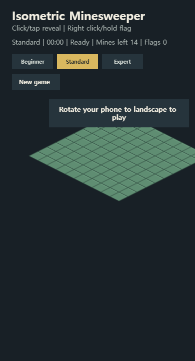
안내 문구는 Phaser Text로 만들었다.
this.orientationNoticeText = this.add
    .text(0, 0, 'Rotate your phone to landscape to play', {
        align: 'center',
        backgroundColor: '#26343c',
        color: '#f3efe2',
        fixedWidth: 280,
        fontFamily: 'system-ui, sans-serif',
        fontSize: '14px',
        fontStyle: '700',
        padding: {
            bottom: 12,
            left: 14,
            right: 14,
            top: 12,
        },
        wordWrap: {
            width: 252,
        },
    })
    .setDepth(30)
    .setOrigin(0.5);
그리고 viewport가 세로 모바일에 해당할 때만 표시한다.
private isPortraitNoticeVisible() {
    return (
        this.scale.width < PORTRAIT_NOTICE_WIDTH &&
        this.scale.height > this.scale.width
    );
}
입력도 막았다.
private isUiPointer(pointer: Phaser.Input.Pointer) {
    return this.isPortraitNoticeVisible() || pointer.worldY < this.uiBottomY;
}
이렇게 하면 세로 화면에서 보드를 실수로 누르는 일을 줄일 수 있다.
웹에서 화면 회전을 강제하는 방법도 떠올릴 수 있다.
하지만 실제 브라우저에서는 제약이 많다. fullscreen 상태에서만 동작하거나, iOS Safari에서는 기대대로 되지 않는 경우가 있다.
그래서 이번 구현에서는 강제 회전보다 안내와 landscape 최적화를 선택했다.
모바일 landscape는 가로가 넓지만 세로가 낮다.
처음에는 데스크톱처럼 제목, 조작 힌트, 상태 문구, 버튼을 모두 보여줬다.
그러자 위쪽 HUD가 보드를 밀어내거나 서로 겹쳤다.
그래서 낮은 landscape에서는 제목과 조작 힌트를 숨겼다.
this.titleText.setVisible(!landscapeShort);
this.inputHintText.setVisible(!landscapeShort);
그리고 버튼과 상태 문구만 남겼다.
const difficultyY = landscapeShort ? 16 : compact ? 108 : 24;
const newGameY = landscapeShort ? 52 : compact ? 148 : 24;

this.uiBottomY = landscapeShort ? 92 : compact ? 198 : 105;
세로 공간이 부족한 화면에서는 정보량을 줄이는 것이 오히려 더 낫다.
조작법은 데스크톱에서는 힌트로 보여주고, 모바일에서는 tap/long press 자체가 자연스럽게 동작하게 두는 쪽으로 정리했다.
게임 CSS도 조금 바꿨다.
기존에는 100vh를 썼다.
#game {
    width: 100vw;
    height: 100vh;
}
모바일 브라우저에서는 주소창과 하단 UI 때문에 100vh가 체감 높이와 다르게 느껴질 때가 있다.
그래서 100dvh로 바꿨다.
body {
    margin: 0;
    min-height: 100dvh;
    overflow: hidden;
    background: #10161a;
    touch-action: none;
}

#game {
    width: 100vw;
    height: 100dvh;
}

canvas {
    display: block;
    touch-action: none;
}
touch-action: none도 추가했다.
게임 canvas 위에서 브라우저 스크롤이나 제스처가 끼어들면 입력이 어색해진다. 특히 long press와 tap을 구분하는 게임에서는 브라우저 기본 터치 동작을 줄이는 편이 낫다.
게임 자체는 /play/isometric-minesweeper/에서 실행된다.
블로그의 소개 페이지는 그 play 페이지를 iframe으로 넣는다.
이번에는 iframe에 allow를 추가했다.
<iframe
    src="/play/isometric-minesweeper/"
    title="Isometric Minesweeper"
    loading="lazy"
    allow="fullscreen; screen-orientation"
    class="border-border h-[min(75vh,620px)] w-full rounded-lg border bg-black"
>
</iframe>
그리고 새 창 버튼 문구도 바꿨다.
가로 화면으로 열기작은 변화지만 모바일 사용자에게는 힌트가 된다.
iframe 안에서 직접 플레이해도 되고, 새 창으로 열어서 가로 화면으로 돌려도 된다.
이번에는 headless Edge로 세 가지 viewport를 캡처했다.
확인하면서 한 번 수정도 했다.
처음 mobile landscape에서는 HUD가 너무 위쪽에 몰려서 텍스트가 겹쳤다.
캡처를 보고 제목과 조작 힌트를 숨기는 쪽으로 바꿨다.
이런 류의 작업은 코드만 봐서는 판단하기 어렵다. 실제 screenshot을 찍어보면 “아, 이건 글자로 설명할 문제가 아니라 그냥 겹쳤네”가 바로 보인다.
빌드는 다음 명령으로 확인했다.
npx tsc --project games/isometric-minesweeper/tsconfig.json
npm --workspace @games/isometric-minesweeper run build
npm run build:games
npm run build:site
build:site 결과에서 /play/isometric-minesweeper/assets/... 경로가 새 JS/CSS 해시로 생성되는 것도 확인했다.
지난번에 asset 404를 만났기 때문에 이 부분은 계속 같이 확인하고 있다.
이번 구현은 게임 규칙을 추가한 작업은 아니다.
하지만 블로그에 웹게임을 올려두고 실제로 플레이하게 만들려면 꼭 필요한 작업이었다.
이번에 정리한 것은 크게 세 가지다.
RESIZE로 바꾸고 resize 때 layout과 render 좌표를 다시 계산했다.특히 이번 글에서 가장 크게 배운 점은 이것이다.
isometric 보드는 그냥 width에 맞춰 줄이면 끝나지 않는다.
보드가 화면에 차지하는 실제 diamond footprint를 계산해야 하고, 모바일 landscape에서는 width보다 height가 더 빡빡한 조건이 될 수 있다.
다음에는 게임 플레이 기록을 남기는 쪽으로 가보려고 한다.
난이도별 최고 기록을 localStorage에 저장하고, clear 시점의 시간을 기록하면 이제 “한 판 플레이하고 끝”이 아니라 “다시 줄여보고 싶은 게임”에 조금 더 가까워질 것이다.
Isometric Minesweeper에 난이도별 최고 기록 저장, Best 표시, New best 상태, 기록 초기화 버튼을 추가하고 이번 지뢰찾기 연재를 마무리했습니다.
지뢰찾기에 난이도 선택과 타이머를 붙이고, 텍스트로 표시하던 깃발과 지뢰를 Phaser Graphics 기반 아이콘으로 바꿔 게임다운 화면으로 다듬었습니다.
지뢰찾기의 손맛을 만드는 빈 칸 연쇄 오픈을 BFS로 구현하고, 새 게임 버튼과 남은 지뢰 수 UI를 추가했습니다.
ECS scaffold 위에 지뢰찾기 규칙을 얹어 Mine, Flag, AdjacentMineCount 상태를 추가하고, 첫 클릭 이후 지뢰를 배치하는 흐름을 구현했습니다.
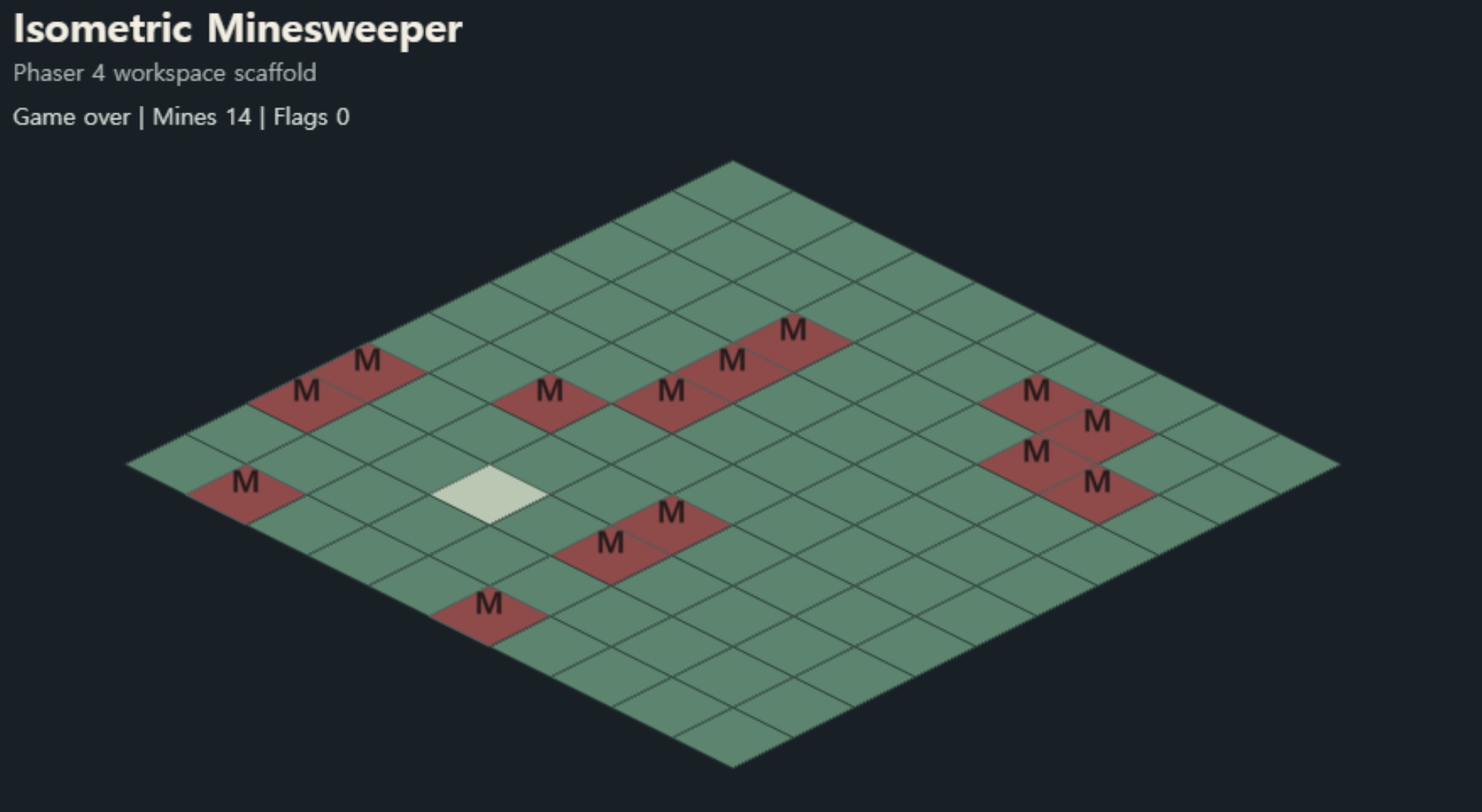
Phaser 4 기반 웹게임을 블로그에서 iframe으로 서비스하기 위한 첫 실험으로, Isometric Minesweeper의 ECS scaffold와 isometric 타일 hover 문제를 정리했습니다.
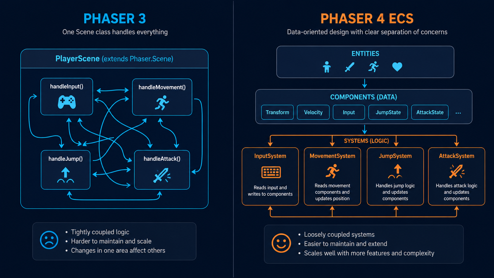
Phaser 3의 Scene 중심 Player 코드를 Phaser 4 ECS 스타일로 옮기는 과정을 실전 예시로 정리했습니다. 이동, 점프, 공격 로직을 단계별로 변환해봅니다.